Thursday 16 June 2016

Marlowe album covers

Marlowe - 'It turning me on'

This particular album cover suggested to me that this is a single female artist because it is only showing a female who has been drawn. 
Representing the fact that the artist does not want to show their real face. 


As the artist is not showing their real selves, this shows they do not want to show their start image, which connotes to the fact that this music would be organic, which applies to Negus's theory. I believe this album would be very organic because the drawing is simplistic so it would mirror the music. 

This album suggest to me that it is Indi pop as it is quick abstract and different from other albums the colour connotes love and anger overall showing the intensity of emotion in the music.  This colour red is shown throughout all albums from this band. I do not particularly this album cover as it is too red so the drawing does not stand out. 

Marlowe - 'Dark sparkle corner'

Looking at this album cover it influences me to think that this is a boy band as it is weird and unexpected, which relates to the Negus theory of music being organic. 

I think the style of the album would be Indi - Rock/Pop because it is edgy and some what haunted as you look at the child facial expressions.


This is very different from other artwork and the previous album target market as it is more old/vintage photograph (quite retro) and targeted to people who like alternative music. The photo also looks quite personal to the band/person as, which shows they are a personal/amateur band. 


Marlowe - 'A Day in July' 

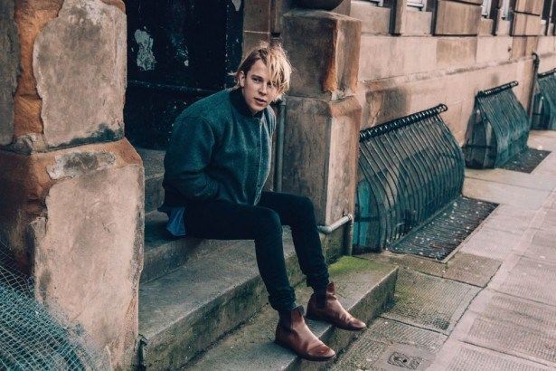
This album suggests to me that it is a three male band as it is a masculine image. The music again is organic and indi alternative. 

It has an alternative vibe as it is cultural with the natural imagery, and the people in the album cover suggests a very relaxed and calming atmosphere and this mirrors the style of the music being relaxed. I would not like the red on the cover as it cuts out some of the photo, i think they should have continued with the image until the album cover ends. However this is the bands signature colour so it links in with that theme and helps make the album recognisable.  


Marlowe - 'Deep Breathe Fake Air' 

I fist assumed this was a boy band, as the image shows a masculine body on the album cover. I think this album is organic however more synthetic this time. The style of music suited for this album cover would be indi alternative (rock/pop) - much more mainstream. 

The colour red is coming through again in this album suggesting its a ritual colour, which is shown through all there albums. The colours contrast each other helped the artwork stand out, however the colours are somehow muted to highlight the fact it is mellow music. 

I like the way in which the words of the album are coming from the drawn males mouth suggesting breathe and air, which links back to the title. This is a very simple way of positioning the words but it is very effective in that sense, this also links to the simplistic vibe of the music as it would be more ambiguous. 


Testcard - 'Lines'

This album cover suggest to me that it belonged to a single male artist, because of its simplicity, which could also link back to the style of the music maybe being alternative, which attracts a specific target audience

1.    Artist – male
2.    Organic ideology – as it is simple
3.    Alternative

4.    Simple but artist as it is a play on words because of the album name. I think the colour is too simple and lack of colour compared to red in the other album cover, however it may reflect the music well.


Madonna - 'Like a Prayer'


Throughout this blog i will be looking at the elements/features of the music video 'like a prayer' by Madonna, i will particularly be looking at the conventions of the video. This whole video has many different controversial elements to it and this heightened convocation of the artist.

This music video relates around Madonna who sees a woman being abused by 2 whites males and Madonna goes to the church for religious guidance. We witness Madonna's previous mistakes and we see her dreaming about her religion, she then falls asleep and wakes whilst still remaining in her dream and this then leads her absent ming to find Jesus. We slowly start noticing that the same black male that got arrested is the man in the church, which is why Madonna suddenly feels guilty as the wrong man went to prison.

'Like a prayer' does not follow a particular narrative for example the artist does not mirror the lyrics of the song so the video's main focus is the performance. We see some close up's of Madonna where she looks directly into the camera. On the other hand there are some aspects of the music video where the movement mirrors the words 'fall from the sky'.
 
Throughout this video there have been many references towards religion and the artists mind track on this subject and she shows her representation of them in this video. An example of this would be how Catholic symbols (crucifix), the Ku Klux Klan cross burning and how Madonna dreams about being with a black saint. Conventions come through when the video shows burning crucifix's. These are used to link Madonna's feelings to show how she has been betrayed by her religion as she did not do the correct thing so therefore she feels as bad as the KKK, as she sent the wrong man to prison. The burning crosses shows Madonna's violence and how powerful she is. Conventions are also used when we see Jesus behind bars in the church, showing a metaphoric convention as the wrong man is in prison.

Madonna appears/presents herself as a strong creature is society and this video heightens this image. This video was made in the late 1980's and this was a huge time for racism and Madonna aimed to make a change to this and vote for equal rights, so this video was made showing different race, religion and gender. 

]During this video Madonna is viewed as a pure, attractive female as she is shown surrounded with white. However Madonna begins to show a certain amount of rebellious aspects, this shows ideologies throughout society, it also shows a sense of feministic theories; a lot of men/some women see woman as a object. This video attract male attention as they are seeing women as a sexual object, which is shown by Madonna wearing tight clothing and having messy hair as this enhances the sexuality of the piece emphasising the attraction. This raised many discussions and problems with the artist’s music video. 

Having in mind that the video was created in 1989, this music video is very modern and upcoming by looking at the very futuristic impacts, it shows she is ahead of time, which created a huge impact on the viewers. This video is not hugely different to more recent videos, which shows she can take risks as an artist and is not afraid to challenge herself. 

This music video was released to the public to help brand her image and to aim her target audience at a much older audience. As if she went for a younger audience they would not understand the messages she was trying to send. Madonna’s more typical music videos were aimed at a much younger audience used as a fashion icon, but wanted to change this to a more mature audience. Women were a huge percentage of this audience as they aspired to be as empowering and having equal rights. There were a lot of male audiences because it gave them pleasure to see women as a sexual object.
 
Overall this video is a video with different political arguments and gained many people who commented both negative and positive remarks. I think Madonna has thought out this video very well using a correct amount of advertisement and marketing to draw in a different audiences and get people to listen to the message she is trying to get across.


Tuesday 14 June 2016

Research into CD digi-pac conventions

 Conventions of a digi-pac:

CD's often have a eye catching image on them
The picture illustrated on the front cover often tend to have a relation to the artist/songs
The song/title of the album is often found on the front cover
A photo of the artist/artists
The name of the artist is always bigger than the album title itself
There is a list of the tracks on the back
A specific bar code

The following albums show different conventions of an album cover 


Looking at this album cover it is subverting to the normal conventions of a CD digi-pac, this is because of the image on the front not being a photo of the actual artist. Also the name of the artist and the album name is the same font but also the same size. The album has a underlined style of alternative music due to the unfocused image, which could have been taken by any amateur, so it is not a typical digi-pac. 
While I was looking at this band I found out it was alternative rock, so i looked up some more alternative rock bands and this is what i found. 


 These are both of the same style/genre of 'Dasiy'. This shows us that the normal conventions of an alternative rock band/artist do not normally show their face. The only difference is the album on the right is clearly created by a professional artist but the album on the left and 'Daisy' could have easily been taken by an amateur. 


This album adheres to the conventions of a digi-pac as it is presenting the artists on the front cover of the album. This helps promote the artists/band as an image and not fully being about the music itself, which is the complete opposite from what 'Daisy' did. 
If you look at the title of the album it is a lot smaller than the name of of the band 'Boyzone', which is another convention of a digi-pac, this also helps show that they are being sold by their name and not their music. This image is clearly taken by a professional photographer, i would have thought by looking at this album the band is pop (contemporary), which was correct when I researched them. the conventions of this digi-pac has worked well as I guesses the style of the music and is was correct. 


These albums are showing a clear boy band group, the conventions of these albums are very similar, you know instantly that these albums covers are pop related. 


This is similar to the alternative rock style in the sense that there is no photo of the artist. This album covers is shown as a heavy metal/rock and this adheres to the conventions of a digi-pac. This style can be easily seen/spotted by the sharp, pointed edges and bright colours of the band name. This underlines the fact that the band is harsh and powerful, also the chair in the centre of the album gives the sense of death as it looks like a electric chair as the electricity is coming from the album band name, which connotes that the music will be electric and heavy. 

A lot of albums that follows this style/genre in music have some sense of death or evil throughout their album and these albums shown connotes this. Suggesting to the audience that the music will be dramatic and harsh for the listeners.


Thursday 9 June 2016

Tom Odell Home Page


I first had to choose a template that I would work around for my Tom Odell website. I chose a calming style as that is Tom’s style of music.


You can change anything you intend to, from changing the images to transitions of the images and this is done all on this tool bar that appears when you hover over the image or text. 

I then looked up all Tom Odell's tour dates and inserted them into the table shows to the left of the screen. This enables people to buy the tickets/take them to the website where they are being sold. 


I then moved on to the music side of the website, this page is showing Tom's most recent video 'Wrong Crowd'. I also downloaded a couple of Tom's new songs from his new album 'Wrong Crowd' to give the audience a sense of his music and the music will play once you press play. 


This is a screenshot of how I downloaded the music onto the tab. 


Then I imported some images of the artist to show his work at concerts or photoshoots that would attract his target market. This lets his fans know what the artist has been getting up to lately in his line of work.


Comparing to the Original: 


 On Tom Odell's original website we are first presented with an image of Tom Odell's new album that can be bought and downloaded/pre-ordered. It gives you all the information needed, this straight away gets the audiences attention and lets them know that there is a new album to download, this will gain the company more money to publicise this album. I did not do this on my website but I think I would have been a really good idea as it promotes the artist's new work in a well functioned way.


This is the original website for the artist. It is built up of layered information that you can dragged into different positions on the screen so they can be easily seen.

I don't think I like this idea of a website because it becomes frantic and harder to see. So the layout of our websites are completely different as mine is more structured and liner.

I think overall the original website brings a different style and vibe than my website. It has a more pop and abstract feel to it rather than his music, which is more Indi and calming, so there is a big contrast between the website and the music.

I have used a very similar font of text than the original website, I picked a simple font as Tom's music is simplistic so I tried to mirror this by the text font. We both involved a picture of his new album, which markets this music product.


This is a link that the original website has put on the website showing all the different ways you can listen and download the music from.


This is a list of all the tour dates that Tom Odell will be attending/performing at. It allows you to buy tickets, which is the same as my website.


This is a link you can click on, which takes you to an amazon website where the album is available to buy/download.


The link to my website:

http://meganmackay3.wix.com/mysite

The link to Tom's original website:

https://www.tomodell.com/