


I first had to choose a template that I would work around for my Tom Odell website. I chose a calming style as that is Tom’s style of music.

You can change anything you intend to, from changing the images to transitions of the images and this is done all on this tool bar that appears when you hover over the image or text.
I then looked up all Tom Odell's tour dates and inserted them into the table shows to the left of the screen. This enables people to buy the tickets/take them to the website where they are being sold.

I then moved on to the music side of the website, this page is showing Tom's most recent video 'Wrong Crowd'. I also downloaded a couple of Tom's new songs from his new album 'Wrong Crowd' to give the audience a sense of his music and the music will play once you press play.

This is a screenshot of how I downloaded the music onto the tab.

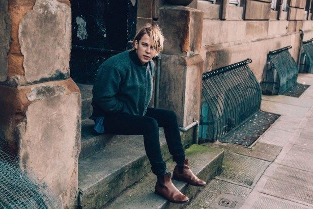
Then I imported some images of the artist to show his work at concerts or photoshoots that would attract his target market. This lets his fans know what the artist has been getting up to lately in his line of work.
Comparing to the Original:

On Tom Odell's original website we are first presented with an image of Tom Odell's new album that can be bought and downloaded/pre-ordered. It gives you all the information needed, this straight away gets the audiences attention and lets them know that there is a new album to download, this will gain the company more money to publicise this album. I did not do this on my website but I think I would have been a really good idea as it promotes the artist's new work in a well functioned way.
This is the original website for the artist. It is built up of layered information that you can dragged into different positions on the screen so they can be easily seen.

I think overall the original website brings a different style and vibe than my website. It has a more pop and abstract feel to it rather than his music, which is more Indi and calming, so there is a big contrast between the website and the music.
I have used a very similar font of text than the original website, I picked a simple font as Tom's music is simplistic so I tried to mirror this by the text font. We both involved a picture of his new album, which markets this music product.

 This is a link that the original website has put on the website showing all the different ways you can listen and download the music from.
This is a list of all the tour dates that Tom Odell will be attending/performing at. It allows you to buy tickets, which is the same as my website.


This is a link you can click on, which takes you to an amazon website where the album is available to buy/download.
The link to my website:
http://meganmackay3.wix.com/mysite
The link to Tom's original website:
https://www.tomodell.com/
No comments:
Post a Comment