Friday 24 February 2017

Audience feedback - YouTube Statistics

This screenshot lets me know that our music video has been viewed 105 times between the 9th Jan - 5th Feb, however this number has increased rapidly, which will be shown in another screenshot. A large number of people viewed our video in the first couple days it was released (18th-19th December) but it is still ongoing.

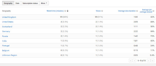
This next image allows me to see where the views have come from (location). The majority of views have been from the UK, which is something that did not come as a surprise to me at all as the production of the video was in english and was uploaded by the school onto the Hurtwood account, also the girls in our video were all from the UK. 


This screenshot helps me see the 'average view duration', which is shown as 1:01, this means at this time the average viewer turns it off, this did not come as a surprise as you get moved onto this music video after seeing the previous one, which means people turn it off within the first couple seconds. Our video has been watched all the way through, which means we are successful however i get worried that people may have got bored after a while, which is why the average watching duration is 1:01. 


This statistic shows me that the ratio from female to male that have watched this music video is very close to almost exactly equal. This shocked our group because we thought the views for our video would me dominated by females, as it symbolises girl power and empowered women, so we did not ever thing the reading would show the two genders being equal. 


The music video's shown target market is 18-24 years as that is the majority of people who have viewed according to the YouTube statistics.

Evaluation Task 3 - What have I learnt from my audience feedback?

Evaluation Task 3 - audience feedback (focus group)

This is a video from our audience feedback session. From this focus group we were able to collect information, positive and negative comments on our whole campaign (music video, website and digipak). We decided to choose this selection of people as they fitted into our target audience, which we found out after looking at our YouTube statistics. 


Wednesday 15 February 2017

Evaluation Task 3 - previous feedback.

Marketing has a huge impact on your campaign and part of getting your marketing on the right track is knowing who your target audience is. You want to know who your selling the products to and how to attract this type of audience so they will invest money into watching the artist/band. We have done a couple audience feedback videos to help us discover our target audience as we needed to know who to aim our campaign at and what appeals that specific audience. Overall we were trying to create something that the ages 16-30 would enjoy and mainly girls as it is a very girl powering group.


This whole discussion began when we started by pitching our ideas to the creative director Luke at Hurtwood. He helped us with our concept and gave us feedback on what aspects of our idea could work and what wouldn't work. After this meeting our views on things changed and we changed our idea completely but keeping the same song. So when we came up with our final pitch idea we ran it past Luke and he gave us very helpful feedback and ideas to make our idea even better, which we took on board and are aspects in our final video. So we pushed through with this final idea and started to think about everything we needed in preparation and who are target audience would be, which helped shape our music video and know how to attract the wanted audience.


Once we had the whole concept of our video we made an animatic and to take our research one step further we asked our peers to help us with some feedback on the animatic, also this helped us get a specific reaction from our age target audience as our peers are age ranging from 16-19.


Overall i think by collecting all this information and people giving us feedback etc. it has really helped us develop our idea and help us work out our target audience. I think we chose a good range of different people to comment on our idea and video to help us and by talking/pitching to Luke help us get to grips with everything and making sure we reached our target audience. So in conclusion all the feedback has been very useful and allowed us to know exactly what to do to appeal to the bands target audience.

Wednesday 8 February 2017

Evaluation Task 2 - Voice over showing how well our music video links with our campaign


This video is showing a how effective our product (music video) was and how it works with our website and CD Digipack. We had to think about how these three products related to the star image we were going for and how well the unique selling point was getting portrayed to the audience.

During my research I looked into Philip Kotler's definition of marketing "Human activity directed at satisfying needs and wants through exchange processes". As i say in the video this means thats the selling of products and services to the audience and enabling them to buy into the star image and this consists of the four variables (the 4 P's) price, place, product and promotion.

Monday 6 February 2017

Evaluation task 1 - (part 4)

Looking at our website for POSSE it adheres to the conventions of a noise pop style website. The website we produce reaches out to 15-30 year olds and is directed more at females rather than males however it does appeal to male demographic. We decided to use bright colours so the name was memorable to the audience, which helps promote the bands name and builds the girl power vibe. We decided to use a lion for the image for the home page because it represents 'king' (king of the jungle). As a group we looked at similar websites that are of the same style and has similar conventions, so we found Autolux. 

Me and Genny found a music artists website 'Sara and Tegan' and it had similar uses of colour in our website and theirs, they focus on the dark blue colour. The font in also very similar, they are both bold and clear, which we need for a new upcoming band where their name is not as circulated/global. Both pictures have images of the artist/artists for part of the websites backgrounds. These similarities show that our website adheres to a pop music websites conventions.

In contrast to this there are some websites that have the same genre that have a completely different style of websites. An example that we found was Miley Cyrus and Justin Bieber are in the same genre of music styles however they have completely different styles. Miley's website has conformed to the conventions of pop by using bright colours/childish, bold and clear writing. However Miley has created her own unique image to fit her controversial look, so the images she uses for her website connect well with her style. Normally websites contain beauty shots where the artists looking high fashion and pose, so fans can aspire to be like them (gaining more fans). An example of this would be Little Mix seen below compared to Miley's website home page.


Evaluation task 1 (part 3) - In what ways does your media product use,develop or challenge forms and conventions of real media products?

I have been searching the conventions of CD digipaks and how they are used as a way to promote the artist/band, i have particularly picked up on that most of the media use techniques and expectable forms to communicate a specific impression. Digipaks add some sort of value to the artist/band and it also inspires fans to buy something that has a bit more information on it about that artist/band and it is seen as a modern take on CD packaging.

For our bands CD digipak I wanted it to mirror their star image of 'girl power', being creative and 'out there', which is why as a group we decided not to go for an image of the girls as we wanted to keep it alternative and different, we think this might intrigue the audience not knowing exactly what they will get, but for the fans they will be excited to see the new piece of artwork created each time. I think this will really excel their USP as a all girl women powered group and this is what i really wanted to focus on. Some people might say that this is unconventional as we are not selling their physical image, although i think this works well for our group and i think this idea will entice the audience.


Although looking at our artwork it is unconventional as it does not have the band represented on the front of the album cover, there are a lot of artists/bands who have followed the same idea, making ours not as unconventional as expected. Comparing our digipak with the Rolling Stones CD cover, they are very similar in the artwork as that is where we took inspiration, however we made it a lot more feminine to fit the conventions of our artists.


Our front cover for the digipak:


Our group wanted something that was eye-catching and bold for the inside cover, so went for something original, having zebra print overlaid with a female body on top, which was created by Genny on Photoshop. The body promotes girl power and femininity however the zebra shows a more edgy/punk side of the music. I think this adheres to the conventions of pop/edgy album artwork.

The inside left side:


The inside right side:

The right side also follows the theme of girl power having the girl sign in the right hand corner, this adheres to a pop video by using bright colours and female features, for example the use of stars and the pink girl power sign, this is so it will appeal to a female audience.


As a group we decided to keep the back page simple and get right back to the point and getting the man of the band out their and making it memorable, again it fits into the conventions of a pop music digipak, by using bright colours and bold text.

Back side: